The journey
The journey to a visual identity
From a document style to the ITARR 3.0 brand
The visual identity of ITARR 3.0 may seem to have emerged in a weekend. It began on 9 August 2026 with a document style. The weekend of 16 to 18 October brought the acceleration.
AI colleagues made the experiments. A person chose at every step.
01 ·
A style for documents first
It started with a report rather than a symbol. We defined the appearance of an ITARR document: Inter for text, Schibsted Grotesk for headings and azul as the only accent colour.
What AI made
A document template with numbered paragraphs and tables that do not split across pages, plus templates for presentations and legal documents.
What a person chose
The owner set the typography: one accent colour, a sharp top-left corner and a short azul line above each title.
02 ·
A proposal for a new symbol
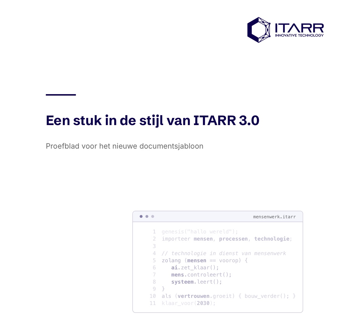
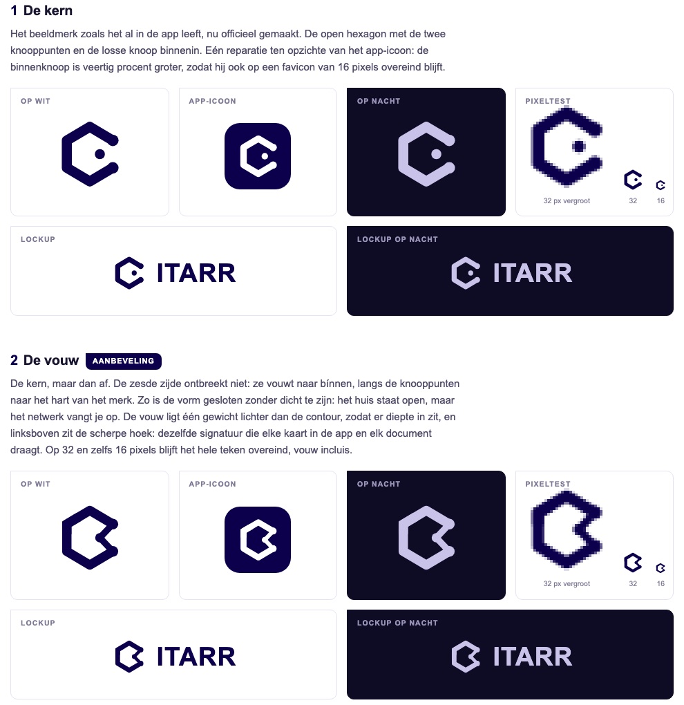
The app icon showed that the brand still used the lettering of 2016, while the documents had moved on. A proposal offered four directions in azul.
What AI made
Four directions: the core, the fold, the link and the word. Each tested on white, on dark, as an app icon and at 32 pixels, and reviewed in nine assessments.
What a person chose
A person left the choice open. The word was set in Schibsted Grotesk.
03 ·
A place to share knowledge
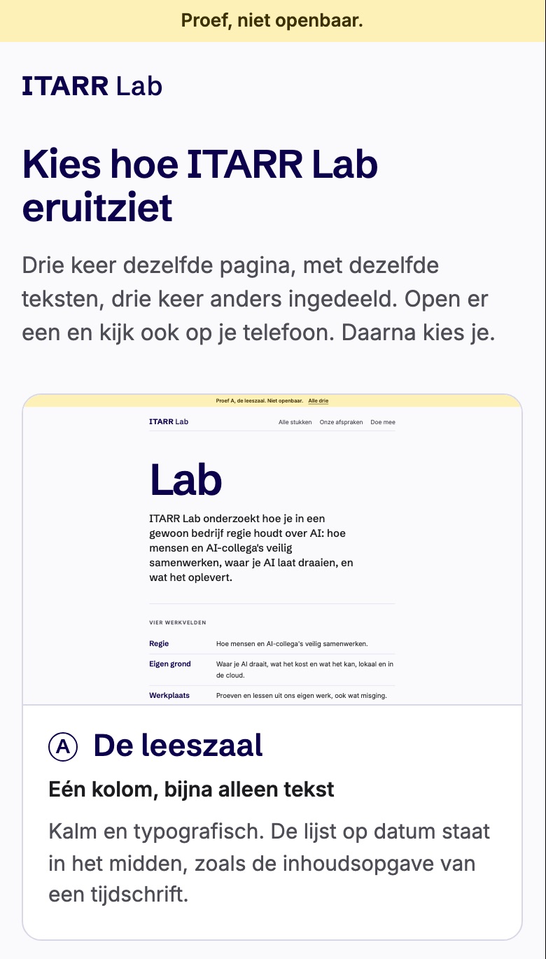
On 16 October we decided to share what we learn openly in ITARR Lab. Three homepage experiments were ready that night.
What AI made
Three layouts using the same text: a reading room, a card first and work areas as blocks, with a page for choosing.
What a person chose
A person chose the work areas as blocks.
04 ·
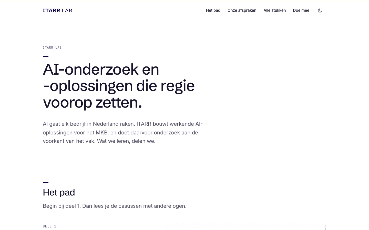
Light by default
The Lab adopted a light theme: white as the ground, dark only through a button. The existing ITARR website set the standard for calm and movement.
What AI made
Typefaces on our own server, without external requests, and quiet motion bringing elements into view.
What a person chose
The owner chose light as the fixed default, as on the existing website.
05 ·
The honeycomb
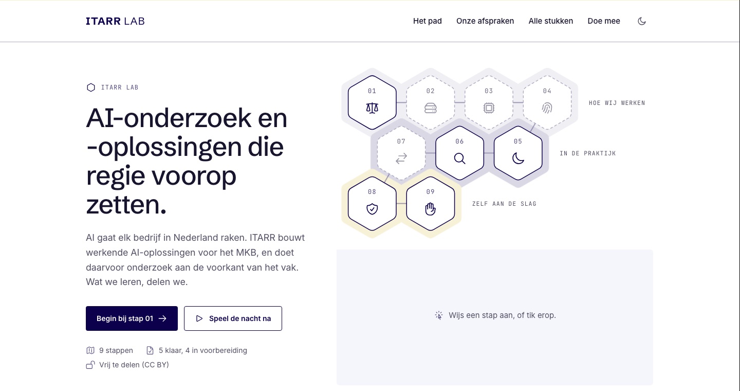
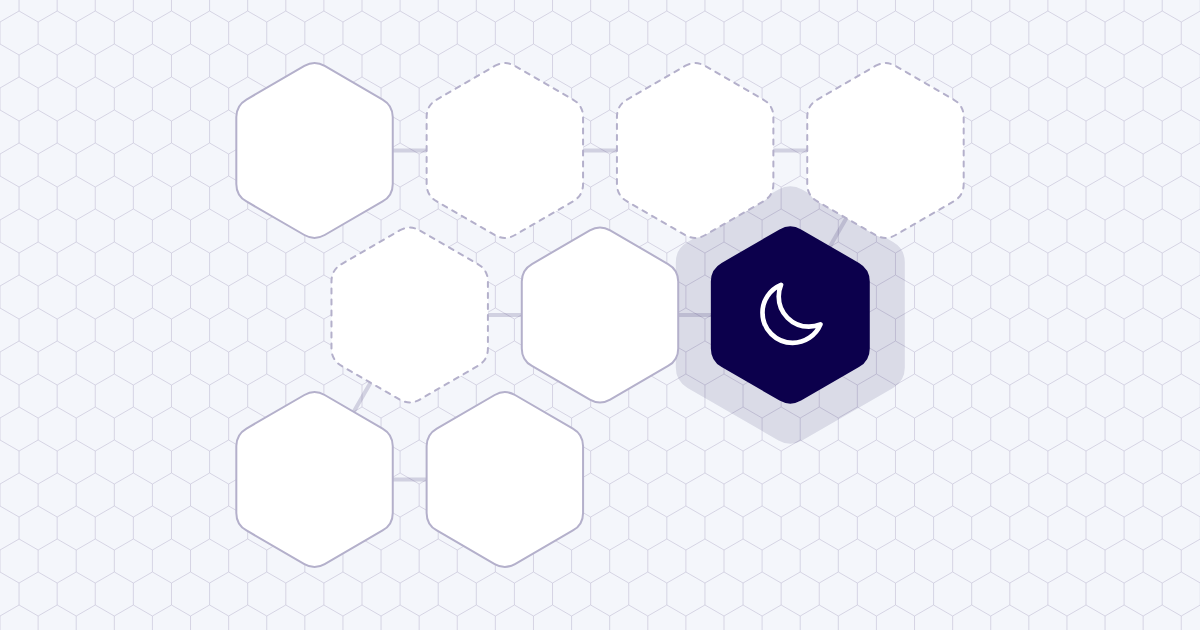
The opening was not inviting enough. Three new openings followed. One presented the path as hexagons: the honeycomb.
What AI made
Three openings: the honeycomb, try it yourself and three entrances. With icons for every step and progress stored in your own browser.
What a person chose
A person chose the honeycomb. The other two stayed as references.
06 ·
ITARR 3.0 speaks the language of the Lab
We decided to build a new website, ITARR 3.0, in the Lab style. First the symbol, then the website.
What AI made
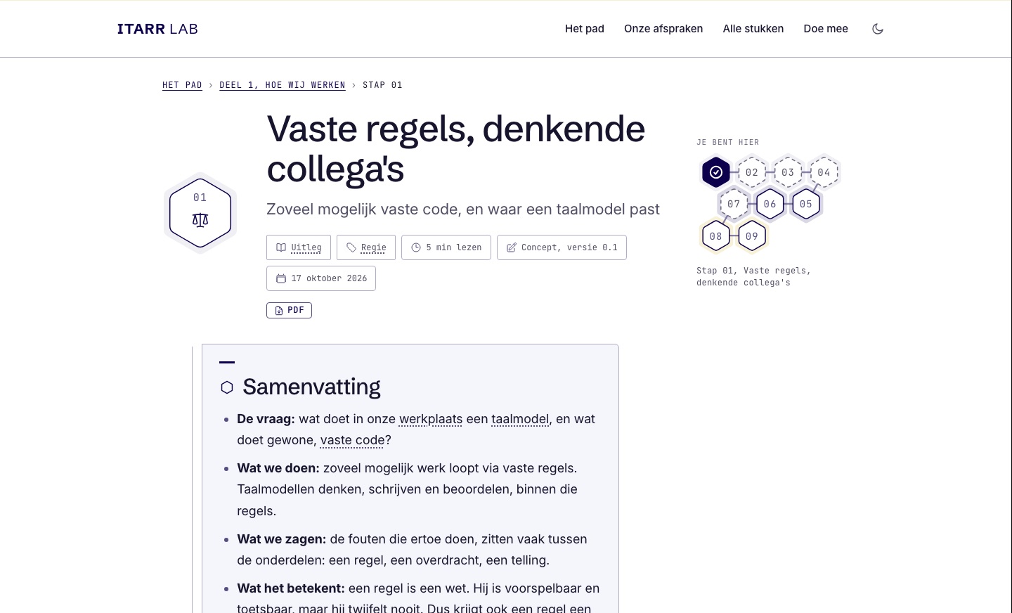
The plan for the website and an article page in the honeycomb style. That page later became the engine underneath the website.
What a person chose
The owner approved the plan: evidence instead of assertions, and choose a symbol first.
07 ·
Three directions for the symbol
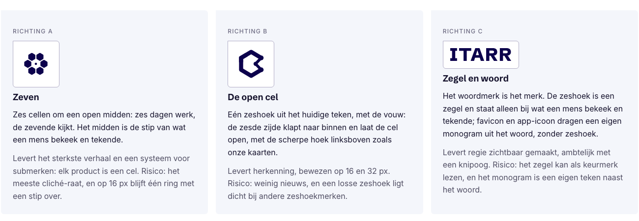
The new symbol began in three directions: Seven, The open cell, and Seal and word. A second colour joined the palette: honey gold.

What AI made
For each direction, a symbol, favicon, app icon, wordmark and horizontal logo, plus a choice page with nine situations.
What a person chose
A person postponed the final choice and asked for Seven to be developed further.
08 ·
From seven cells to a fine grid
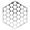
Seven became finer across four rounds: first tighter and drawn as lines, then a honeycomb inside the cell, then a fine grid like the field on the homepage.
What AI made
New variants each round with a header, favicon, app icon and sharing image, and a check of what stayed legible at 16 and 32 pixels.
What a person chose
After every round a person gave comments and direction: finer, point upwards, focus at the centre and open edges.

09 ·
Cell and open edge
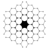
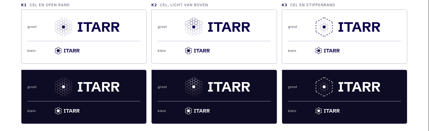
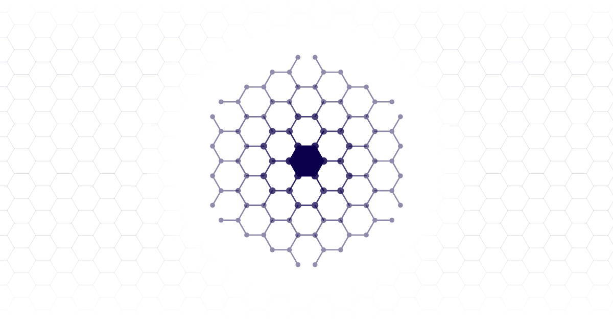
The symbol emerged from three final combinations: a fine grid of hexagons, a filled cell in the centre and open edges ending in dots.
What AI made
Three combinations, large and small, on white and dark: cell with open edge, cell lit from above, and cell with dotted edge. The AI colleagues advised the dotted edge.
What a person chose
The owner chose cell and open edge, adding three wishes: the word must fit, the symbol lives everywhere, and the homepage field speaks the same language.
10 ·
The symbol comes alive
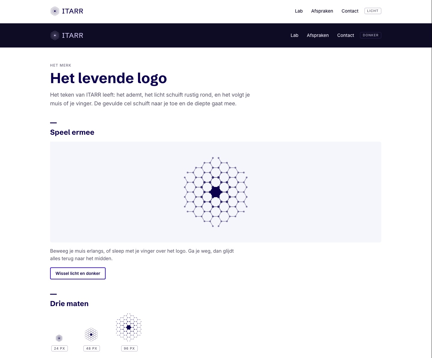
The symbol had to live everywhere. It now breathes gently, light moves slowly around it and the filled cell approaches your mouse or finger.
What AI made
A living symbol with a static fallback, and a description with all its numbers so apps can reproduce it precisely.
What a person chose
A person watched the demo and kept the living symbol as it was.
11 ·
The word beside the symbol
The word ITARR had to fit the fine symbol. We also wrote it in the honeycomb, but typeset lettering won and then became slightly thinner.
What AI made
Word variants in three weights beside the symbol, two rounds of honeycomb lettering and a block with thinner letters.
What a person chose
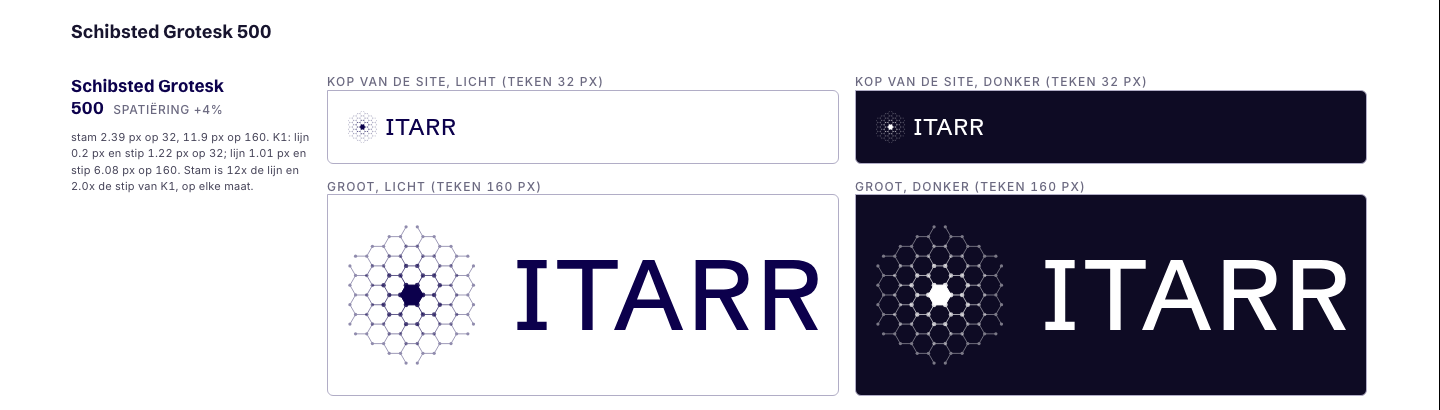
The owner chose Schibsted Grotesk, then weight 500 with 4 per cent more space between letters. The honeycomb versions stayed experiments.
12 ·
No more fixed-width type
On 1 September the fixed-width typeface had already left our documents. On 18 October it went everywhere: from the website, the experiments and the documents.
What AI made
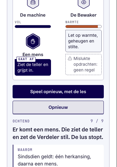
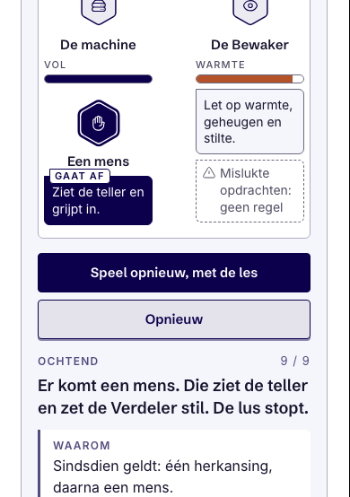
Labels and numbers in Inter with tabular figures, large numbers in Schibsted Grotesk, and a typeface check at every delivery.
What a person chose
The owner prohibited the fixed-width typeface without replacing it with another one.
13 ·
Documents and sharing images
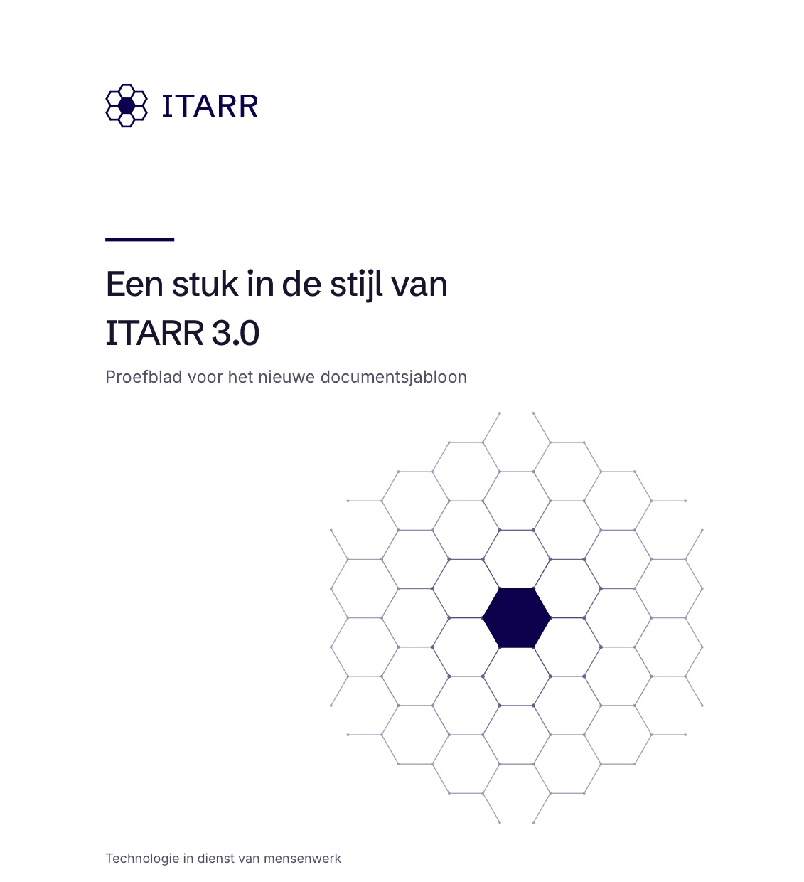
The document template adopted the 3.0 style, with the new symbol and a honeycomb on the cover. Every Lab article received its own sharing image.
What AI made
Print versions of the symbol for large and small use, outlined lettering, the honeycomb cover and sharing images of 1200 by 630 pixels.
What a person chose
The owner chose to keep the same template and names, making the switch one line while old documents continued to work.
14 ·
The cover, sharing images and one gold
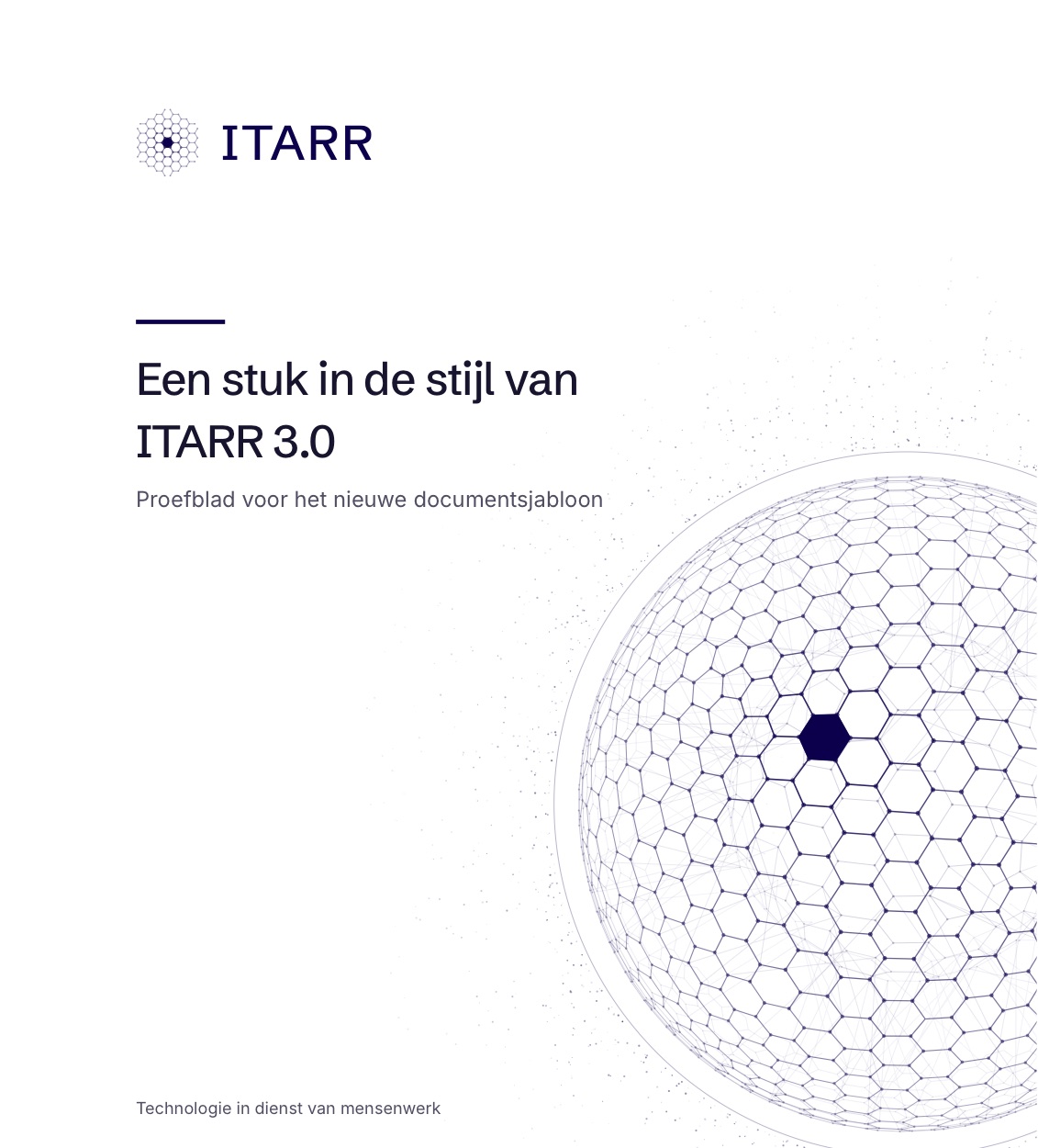
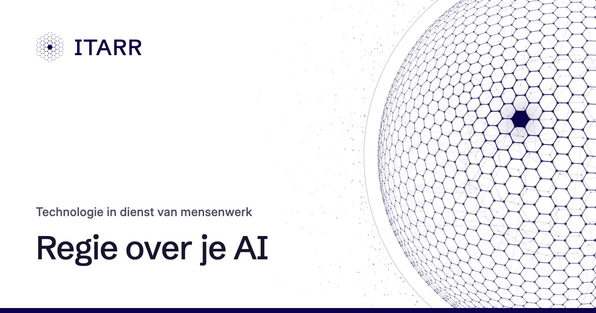
A day later, every document cover received the sphere of the symbol, large and pale across the right edge. Every website page received a sharing image with the logo, title and sphere.
What AI made
The cover and sharing images from one file defining the position and colours of the sphere, with a distinct sharing image for each page.
What a person chose
The owner chose the large sphere across the edge from three proposals, and one gold: crown gold on dark, honey gold on white.
The result
The visual identity of ITARR 3.0 in seven sheets. Each sheet gives the rule, an example and how to use it.
The symbol
The rule
- Cell and open edge: a fine grid of flat hexagons, together forming a hexagon with a point at the top.
- The middle cell is filled. From that cell the grid fades outwards to roughly 0.45.
- The edges are open and end in a dot, without an outer outline.
How to use it
- Azul on white, crown gold or white on dark.
- At small sizes the symbol uses heavier lines and larger dots.
- In print, from 3 to 12 millimetres wide, the symbol has a heavier version. The symbol itself appears on the cover and at the end of a document.
The word
The rule
- ITARR in Schibsted Grotesk, weight 500, with 4 per cent extra letter spacing.
- The word sits to the right of the symbol.
How to use it
- On the website the word is text; in documents and images it uses outlines.
- Honeycomb lettering stayed an experiment. Always use the typeset word.
The colours
The rule
- Light is the default. Dark is chosen with a button.
- One gold: crown gold on dark, honey gold on white.
- No pale yellow background areas. On dark, light blends like a screen, never into a white spot.
- Azul #0C004C
- Crown gold #ECB652
- Honey gold #C4821A
How to use it
- Azul carries the brand. Gold is an accent.
- The symbol takes on the colour of the page.
The typefaces
The rule
- Schibsted Grotesk for headings, Inter for text.
- Labels, tables and numbers in Inter with tabular figures.
- Large numbers serving as headings in Schibsted Grotesk.
- No fixed-width typeface, including for code. Code uses Inter on a light tint.
How to use it
- Both typefaces are served from our own server with their open licences.
- You can see both at work on this page.
Movement
The rule
- The symbol lives: it breathes gently, light moves slowly around it and the filled cell approaches your mouse or finger.
- The honeycomb field on the homepage speaks the same language: a fine grid with a filled cell following your attention.
- With reduced motion everything stands still.
How to use it
- At most one quiet wink per page.
- Only thin lines, no flashes across the whole area, never more than three flashes per second.
Documents
The rule
- The cover carries the sphere of the symbol, large and pale across the right edge.
- Headings in Schibsted Grotesk; text, header and footer in Inter, with the print version of the symbol.
How to use it
- One template for every document. Switching to 3.0 takes one line; old documents keep working.
Sharing images
The rule
- Each address has its own sharing image of 1200 by 630 pixels.
- A website page uses the logo at the top left, the title at the bottom left and the sphere on the right. A Lab article uses the honeycomb with that article highlighted.
How to use it
- The image appears when someone shares a link in a message or on social media.